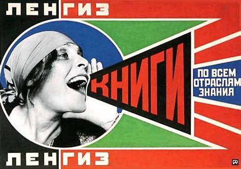
Sixties Without Any Substance: My Critique of Alexa Chung’s Interviewing

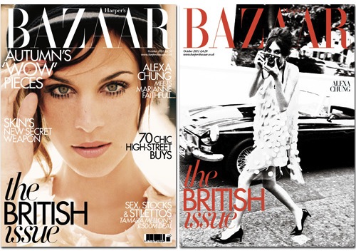
With her piece for the latest issue of Harper’s Bazaar UK, Alexa Chung adds print journalist and interviewer to her already extensive résumé. Harpers heralds Chung as a “muse, designer, model, DJ and TV presenter” – a job title as long as it is meaningless. Why the UK-based magazine even has a “British issue” is beyond me, but Chung has been chosen as the issue’s cover girl as she “epitomes a uniquely British style.” Her assignment for Harpers was to interview three female icons from the 1960s; Penelope Tree, Marianne Faithfull and Pattie Boyd. These short interviews, only six questions each, appeared alongside a profile of Chung conducted by journalist Stephanie Rafanelli. In contrast to the Q & A style of Chung’s interviews, Rafanelli’s piece was longer with the dialogue interspersed throughout the feature.

Chung’s opening question to Penelope Tree set the tone for all three interviews; an unusual ramble, more of a recounting of facts than an actual question. “You were born in England, but moved to New York when you were very young. Your mum was a prolific socialite and you were left to your own devices.” I’m sure Tree is aware of these facts and does not need them reiterated to her. Chung’s concern that the readers of Harpers may not be aware of Tree’s life story is justified, but this information would be a lot more suitable in an introduction before the article than embedded in the question.

Her first question to Pattie Boyd was almost as belabored “You were discovered as a model in 1962, while you were shampooing at Elizabeth Arden. Then you modeled for Mary Quant. What was it like?” Chung then quickly half-answers this question herself by adding “There must have been a real buzz.”, leaving Boyd with nothing much to do but agree with the statement. This was quickly followed second, almost identical question “what was your most iconic memory?” Chung has a habit, perhaps due to nervousness, of asking duplicates of basically the same question. During Pattie Boyd she asks “what struck you about him?” followed directly by “what was going through your mind?”

She also seems insecure about the strength of her own questions, cramming them with Sixties references and choosing questions to include several in the each. This usually leaves the interviewees confused about what to address first. As each interview progresses, Chung’s questions become shorter and less belabored but the interviews rarely have a conversational quality. The only narrative structure I could find is that they are ordered somewhat chronologically. I postulate that if the order of questions were reorganized, the interviews would still feel very similar.

During her interview, Penelope Tree recalls how during her time at a strict boarding school in Massachusetts she began planning to escape to London. As a reader, your natural reaction is to wonder how she managed this, but Chung never follows up with her. This is very dissatisfying. You get the sense that she, for whatever reason, doesn’t want to veer far from her prepared script.

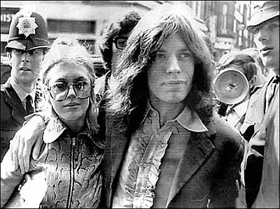
Her interview with Marianne Faithfull is the exception. Most questions are derived from Faithfull’s previous answers therefore the interview feels more like a natural conversation. But despite their rapport, her questions remain depthless and Faithfull’s post-Sixties struggles are never alluded to. In her own interview, Chung is adamant that “the girls in the Sixties were never over-shadowed by the men they dated.” Yet ironically, while interviewing these women, she spends half the time asking them about their love affairs. She never asks Maryanne Faithfull her about her own music career, opting instead for questions about her ex-husbands Mick Jagger and artist John Bundar.

As a more experienced interviewer, Rafanelli managed to get some revealing quotes from Chung, including her resentment towards members of the public stealing her Sixties style: “Everyone copied my soading coat.” There is a mysticism surrounding the Swinging Sixties in London, one that Chung certainly buys into. She contemplates how she has always been “attracted to the groupie vibe” Her use of the word vibe is interesting here since during her interviews, she seemed far more concerned with the idea of the Sixties and the styles of these women than their actual experiences.  She understands very little about actual place of women then and fails remember that these “women” were in fact incredibly young, often in their late teens.

Harper’s describe Chung as a “reincarnation” of these Sixties icons. An interview is a conversation with a purpose, and the purpose here seems to be to lend creditability to Chung by associating her with this bohemian past. Her constant references and borderline obsession with dates are used more to prove her knowledge of this period, than actually contribute anything to the interviews. What results are questions crammed full of facts, but interviews of little actual substance.
My Favourite Movie Poster of all time (Seriously.)

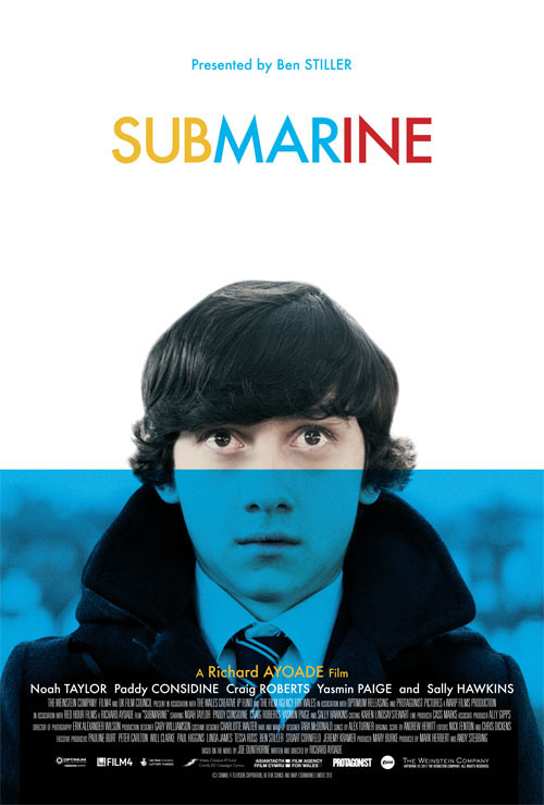
I realise that this is quite a big statement to make, since there are probably millions of movie posters in the world and there’s no way I could have seen them all, but I’m in a big statement kind of mood. And seriously, this is just stunning. The first time I came across it, I think I stared at it for 10 minutes – which in internet time is about 18 hours – am I still love looking at it. The typography placement is very unusual so it really changes the way you look at the image.

There is a great interview with the designer Akiko Stehrenberger, where she discusses the poster in detail so I think I’ll let the poster do the talking, or if you’d prefer you can hear it straight from designer..

But here’s a few images the poster reminds me of..

Sharbat Gula’s piercing green eyes in Steve McCurry’s famous photograph for National Geographic.


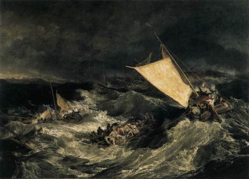
The extreme contrasts of blacks and creams in William Turner’s ‘The Shipwreck’

And Lucien Freud’s portraits, especially the shadows on the person’s face.

Chris Brown is Insecure

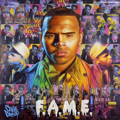
Anyone that knows me, knows I despise Chris Brown. It really bothers me when people say that he hit Rihanna, when he really beat her to a pulp. In an interview with Mtv Rihanna described Chris Brown as “insecure” and “controlling”. You can definitely see those characteristics, and many others including narcissism and a desire for respect, in how he chose to represent himself through his album cover for ‘F.A.M.E.’. The deliberately ambiguous title supposedly stands for both Fans Are My Everything or Forgiving All My Enemies.

The cover is made to look like a hand painted mural, with Chris Brown’s face repeated over 30 times. The spray-paint-style logo looks so cheesy and the drips off the F.A.M.E. looks more like a Halloween font, than anything a street artist would do. The clown motif is a direct lift from Banksy. In fact, the whole cover has a Banksy rip-off about it.

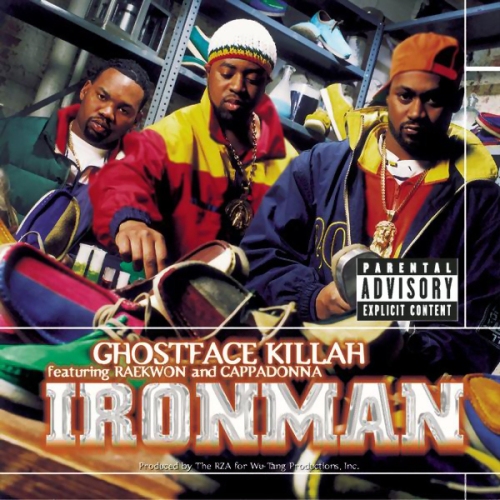
The colours are definitely lifted from hip hop covers from the 1990s, such as  Ghostface Killah’s ‘Ironman’. This shows he is trying to affiliate himself with the hip hop world, and less with the pop world. Chris Brown is a manufactured pop star, with his only quality linking him to the hip hop world being his objectification and disrespect for woman. His first video for “Run It” shows his dancing around some school sports hall, not dissimilar to Justin Bieber. He is clearly insecure about this. Chris, you’ll never have the passion of Tribe Called Quest or intelligence of Jay Z. Please just quit now.

Submarine Movie (Poster) Review

The designer was clearly influenced by screen-printing as illustrated by the colour choice and the  simple over-printing of a cyan square over the actor’s face. Exclusively using CMYK colours is becoming incredibly overdone. Cyan is one of the process colours and looks striking here but I’m relieved that the designer has chosen more unusual variations of yellow and magenta/red to split up the movie’s title.  I adore desaturated photograph – not quite black and white, but almost there. The boy’s expression is great, though it looks like he’s somehow looking in two directions at one..

Since the movie is presented by Ben Stiller, I was originally concerned that it might be an attempt at making a very American indie movie – basically 500 Days of Summer with a younger cast. But I find that the designer chose the very British  Gill Sans reassuring. Gill Sans is also used by the British Railway, Penguin Books and Bloc Party.

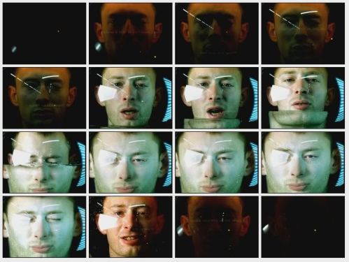
I like the subtle drowning reference. It actually reminds me of the amazing Radiohead No Surprises video. Though maybe I just have Radiohead on the mind since their new album ‘The King of Limbs’  is coming out very soon.
To read a review of the actual movie, check out the New York Times review.

Les Triplettes de Belleville

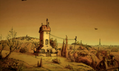
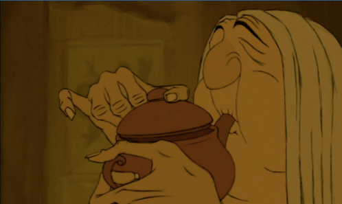
Madame Souza’s home in Sylvain Chomet’s dark, comic vision “Les Triplettes de Belleville” may resemble a vintage store in Williamsburg, but it also looks like a grandmother owns it. The minute we step inside her home, we know Madame Souza’s is a traditional French woman. She has decorated her house with a floral patterned furniture, grandfather clock, antique piano, hardback books and carved wooden chairs. Sylvain Chomet’s attention to detail is superb; down to the tiny “O Galo de Barcelos “(Portuguese rooster) motifs on her plastic tablecloth.

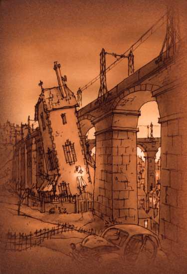
Madame Souza’s home illustrates that she is a strong-willed traditionalist. Seasons pass and everything in the area around her little provincial house in the French countryside changes; new buildings spring up and modern airplanes soar above, and eventually her home is shouldered to one side by an elevated highway, but her house’s interior remains the same.

We are made aware from the very beginning that she is thrifty and industrious. She compensates for her uneven leg length with one platform heel and one flat shoe. She knits constantly. Some of the objects she owns are old, but they are well taken care of, repaired and never discarded. Everything she owns seems to serve a dual purpose like when she uses her whisk to massage her grandson Champion’s calves after a long cycle, a thoughtful action showing her dedication to her grandson’s well being.

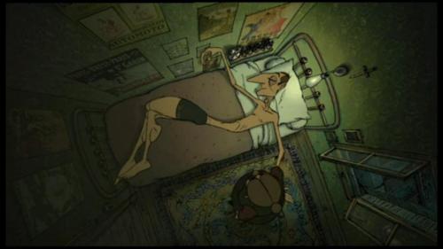
Her grandson’s bedroom is decorated entirely in bicycle motifs including wallpaper, sheets, photographs, and trinkets and represent his obsessive personality and love of cycling. Champion’s bed stays the same from his youth to adulthood and we see him curve himself to fit the shape, again alluding to the family’s frugal, sparing nature.

When her grandson is kidnapped by the French mafia and taken to Belleville, Madame Souza doesn’t jump in a speedboat or cling to the side of the ship, she (somehow!) travels to Belleville on a small pedal boat, simply ignoring the 1Franc per 20 minutes rule.

While resting under a bridge, she meets the Triplets of Belleville, three eccentric elderly sisters, who were once successful vaudeville performers. But although the triplets and Madame Souza never utter a word to each other, they have an affinity through making music with everyday objects – Madame Souza with a bicycle wheel and the sisters with every object imaginable. And when the triplets invite her to their home, we learn they also both share a fondness for floral patterns and carved wood.

You follow the triplets through a narrow seedy corridor full of open toilets, flies and prostitutes and are welcomed into their home. The dimly lit apartment has a similar aesthetic to the speakeasy but also to Madam Souza’s home, albeit a lot less coordinated. There remains a hint of old world grandeur as the objects were certainly decadent at one point, but an air of decaying luxury dominates as the torn floral wallpaper reveals exposed wood, the beautiful antique piano is horribly out of tune and the floral chaise longue is quite worn.

There is certainly a grotesque quality to the women’s actions in their homes like as they comb their long hair and admire themselves in the dusty mirror. They seem to ignore the passing or time and reject change by hoarding every worn, declining object. Photographs in an assortment frames hold tightly to their memories. Both homes look as through nothing has changed in the past fifty years, but for different reasons. Madame’s reason is to not being wasteful, but for the elderly triplets it is about not wanting to let go of their luxurious past. Our objects are reminders of time’s passing, and although they may get dusty or worn, it is actually us who changes most drastically.

The triplet’s eccentric, offbeat personality manifests itself in the apartment’s decoration. All logic is abandoned at the door: instruments adorn the walls and perfectly polished, empty fridges are treasured and played like a double bass. These same household items transition from musical instruments to weapons and shields in the exciting final scene, elevating the ordinary object along the streets of Belleville.

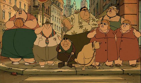
These streets in the bustling metropolis are equally quirky and surreal as the interiors of the buildings. The city is loosely based on New York, as evidenced by the fat Statue of Liberty on the waterfront, but is also part Montreal. The decaying Beaux-Arts buildings have been distorted and stretched and then piled on top of each other. Chomet also takes great
artistic liberty in exaggerating people’s shape to be either grotesquely fat or horribly skinny, so they too become like surreal props. It is heavy handed, exaggerated, and yes, borderline racist, but that’s the point – it gives the movie its quirky, creepy, unearthly quality.

Animation gives directors the freedom to completely dictate the look of every single aspect of a movie, from its characters, streets, buildings to its objects so they all become production design decisions. Animation often uses these elements not only to reflect the personalities of the characters in the movie but also to point our own views of people and places, whether they are idolized, negative or overly simplified. In the “Team America” movie’s opening scene in Paris, the streets are paved with croissant shapes and all familiar landmarks like the Eiffel Tower and the L’Arc de Triomphe are mere meters from each other. These kinds of animated films give us a glimpse into how Europeans views America and how Americans views Europe – and even though we don’t always want to admit it, it can be a reminder of the stereotypical views that we believe in.

Seeing Double

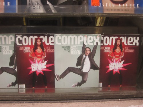
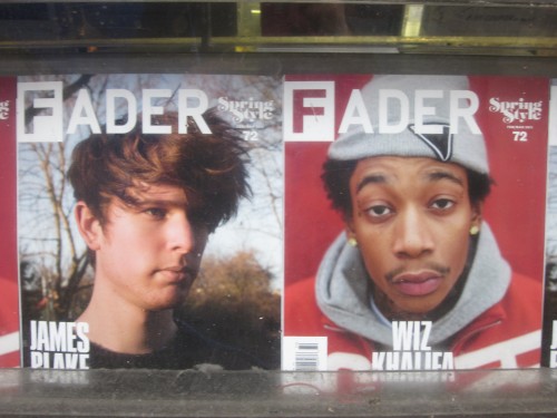
I’ve noticed that so many magazines are now doing double covers. It makes sense: with many magazines struggling to stay afloat, publishers and designers are experimenting with new ways to keep their magazine successful, from iPad apps, to charging for their online content, to these double covers. A double cover, er, doubles the chances grabbing a potential buyer’s interest.

The current issue of LOVE has both Kate Moss and Justin Bieber on the cover – haven’t caught Bieber fever yet? Well, surely you must still love Moss. It also offers the opportunity to post twice as many cover stories, without cluttering the front paper. More into London’s electronic music scene than Pittsburg hip-hop? Well, still pick up a copy of Fader’s Spring Style issue because they’re featuring both!

Generally in stores, more than one copy is exposed at a time. But this may be less effective in the many small bodegas dotted along NYC’s busy streets, where usually only one copy of each magazine faces forward. I wonder are publishers losing a lot of revenue by not having an advertisement on the back of the magazine anymore.. Hopefully the increased sales will pay off. I love a good magazine so I hope all these new initiatives work!

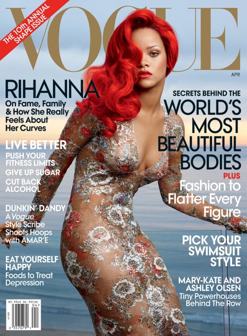
Dissecting the Magazine Cover: Rihanna on Vogue

On this month’s cover of Vogue, posing in an embellished lace floral Chanel dress, Rihanna looks like a confident symbol of rebirth. The decision to dye her hair a poppy-red is surely no accident, representing a post-war period in her life, where the battleground has cleared and flowers have been allowed to flourish. Rihanna’s journey after a traumatic domestic abuse attack has played out through her fashion choices at a series of public stages including music videos, award show appearances, and magazine covers.

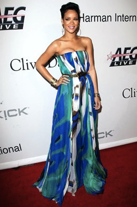
Floral motifs were present at the beginning of Rihanna’s career, where her fashion choices echoed her Barbadian heritage, giving her a genuine distinction from pop and R’n’B singers already on the market. In her first music video ‘Pon De Replay’ she sports a gold bikini top, a floral patterned dress, large gold hoop earrings and numerous chunky bangles. These Caribbean accents were Americanized by pairing them with casual baggy jeans and Converse sneakers to give her a more relatable look for her target audience. This early public image was certainly wholesome, but had less of the exaggerated girl-next-door quality thrust upon other pop stars like Britney Spears, or what I like to call the “Like a virgin (like we’re all stupid!)” persona.
As her career progressed, Rihanna’s style choices became more unpredictable, modeling an ever-changing parade of fashion choices and shorter haircuts. This new, daring fashion style was a considered, intelligent decision to distinguish herself. Rihanna worked closely with producer Jay Z, and therefore suffered from numerous accusations of simply being a clone of Jay Z’s wife Beyoncé.

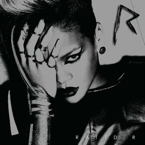
In the ‘Disturbia’ music video , she had more gothic fashion style, wearing dark colors, chocker necklaces and mesh top barbed wire motifs. This “edgier” phase in a pop star’s lifecycle usually occurs two years or two albums, whichever happens to come first, into a pop singer’s career. This new fashion persona is usually signaled by the release of an edgy or artistic music video. Britney Spears, exhibited a more gothic look in the ‘Stronger’ video where she sang the infamous line “My loneliness ain’t killing me no more”, a reference to her first single. Christina Aguilera’s ‘Fighter’ was a kind of experimental art video with a convoluted butterfly theme. Whether true of not, these videos gives the impression of a pop star’s increased creative freedom or adult status, and a familiar cry from every entertainment magazine heralds, “[insert pop starlet here] is all grown-up!”
Next along the pop star lifecycle trajectory is an extremely provocative phase which is often the result of a slump in sales or a massive rebellion against their constructed virginal image. Throughout her career Rihanna wore her sexuality on her sleeve – or rather on her hips – using provocative, tight-fitted clothes to accentuate her curves. Animal prints were a reoccurring motif alluding to an animal and instinctive sexual nature. While many mothers of teenage fans may not approve of this highly sexual demeanor, it is certainly a more honest, if not healthier, attitude towards sex. There was never any doubt that Rihanna and her then-boyfriend Chris Brown were having a sexual relationship, refusing to do the usual “oh we’re just good friends” routine followed by a disingenuous giggle.

The next dramatic change in Rihanna’s fashion sense was brought on by tragic event, when she was viciously attacked by Chris Brown. The night of the attack she was wearing a flowing, pastel watercolor Gucci gown; a feminine style that almost completely disappeared in the years following the attack.

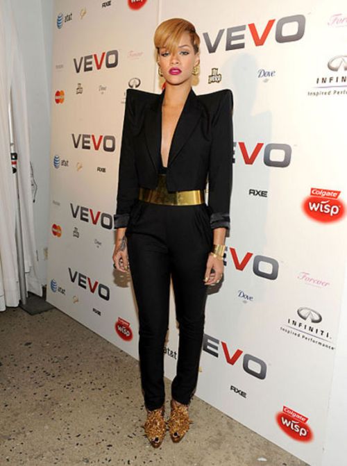
Although Rihanna refused to speak publicly about the incident, she spoke through her fashion choices, shifting to an androgynous but still highly sexualized look, alternating between re-appropriated masculine suits and army styles. Rihanna used fashion to cope, building a protective wall of harsher materials including leather, spikes and structural material. Large shoulder pads were her assertion of power during a difficult time, much like how women in the workforce chose them during the 1990s and Reagan-era.

Hairstyles and tattoos also played a huge part in her new look. She shaved the side of her hair, a poignant symbol of entering the army and now possesses no less than thirteen tattoos, including one on her chest “Never a failure, always a lesson” backwards so that she can read it in the mirror.

But Rihanna’s cries through her fashion choices and lyrics, “I, I, I, I’m so hard. Yeah, Yeah, Yeah, I’m so hard. So hard, So hard, So hard, So hard.” are reminiscent of “the lady doth protest too much. ”, an over compensation indicating that perhaps she was struggling more than she would allow herself to admit in public. Her music videos for ‘Russian Roulette’ and ‘Hard’ were flooded with war imagery and she wore aggressive artifacts revealing top made of bullets, shields and army jackets. There is also a knowingness to her fashion choices; her army helmet is shaped with Mickey Mouse ears possibly making statements about pop star’s constructed identity.

It’s important to note that a pop star can often have little power over what they wear, so there is always the concern that these public personas could be forced upon Rihanna. But I’ll finish with her own words about her personality, and hope for her sake that it isn’t purely constructed by other people: “Brilliant, resilient, fan mail from 27 million”.

Pour

The teapot is timeless
cream,
$56
extortionate
neutral
compatible with anything
anywhere,
anywhen.

Comfortable in the uncertainty of an empty shelf
of unmet companions
and unborn conversations.

This first earthenware brick
of the future I hope to build,
with the man I love
in this over-brewed city;
the overwhelmingly
too bitter,
too sharp,
too much.

Unboiling under unwavering eyes,
steeping
the anticipation

of Irish Breakfast
Sunday mornings
and Thursday evenings
of
warmth
relaxation
and the New York Times.

the Lady Greys
of
elegant
social
occasions.

The Russian Caravans
of
good friends
gathering.

Anticipating
the day
when I have enough company
to put away my single tea-bags
in single cups
for good.

Its generous curves
pregnant with possibility,
filling, drip by drip
with futures
as solid as vapor
and tea-leaf prophecies.

A cresting wave
frozen,
a surge impending
through my life
clearing my debts,
cleaning the subways,
renewing the streets.

But for now,
It sits,
silent,
lonely
and waiting.

Deconstructing the Black Swan Posters

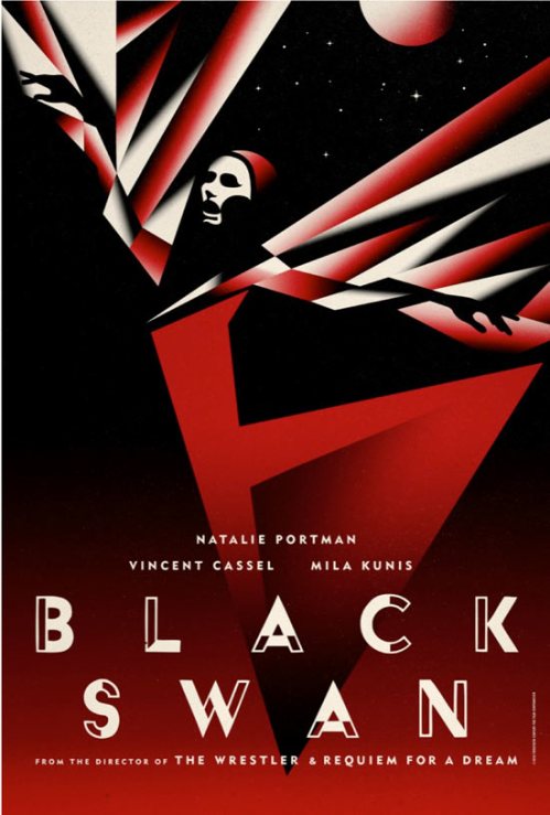
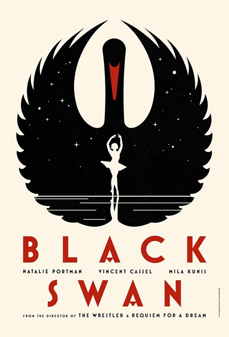
Before the release of Darren Aronofsky’s newest movie ‘Black Swan’, a number of creative posters were released to great acclaim. I remember the first time I heard about Black Swan when my friends began linking to the posters and saying how beautiful they were. They looked more like theatre posters than movie posters, which are generally not illustrated. Though perhaps because of their success and critical acclaim, more creative posters like these will be created.

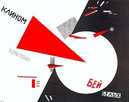
The posters were clearly inspired by Russian Constructivist and  done colours associated with era- red, black and cream.

El Lissitzky was one of the pioneers of the Constructivist movement in Russia. The shapes of one of his most iconic pieces ‘Beat the Whites with the Red Wedge’ are used in this first piece. The shadows give it the style of sprayed paint. The haunting face is very theatrical.

The repetition of the dancer’s arms is reminiscent of the repetition used in photo montage. The side profile, and hands in silhouette are important symbols of Constructivism.

The final poster uses typography influenced by the era. There are now digital typefaces available in that style such as P22 Constructivist Square

I found this poster from the 1932 movie Red-Headed women which uses a very similar aesthetic. She certainly looks fiery.

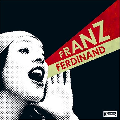
The Constructivist era is one of the most referenced art periods. In 2005, Franz Ferdinand released ‘You Could Have It So Much Better’ and spurned conversations about whether the cover was a homage to the era or a direct rip-off.

What do you think?

Not Too Quiet on the Western Front

I’ve noticed a slowly growing trend of graphic design that is clearly influenced by the wild west. Worn typography is being used everywhere, usually in browns and reds. Faded paper, like the kind you would make as a child by staining it with tea, is also very common. And, of course, the cowboy archetype has been popping up too. Could it be that cowboys are the new vampires?

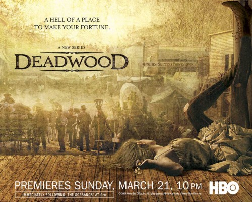
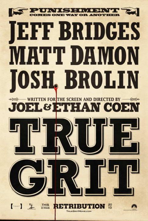
The popular HBO show Deadwood is also probably a big influence, though perhaps less so than the release of True Grit in December 2010. I really hate the true grit poster. It is so bad that I still wonder if it’s meant to be ironic.  The little pointing fingers look like MS clip art, the gun shot and blood looks like a stock photos.. I don’t understand it. The Deadwood poster on the other hand is gorgeous. The unusual composition is beautifully photographed, multi-layered with perfect typography.

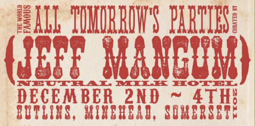
The new ATP promotional material is a good example of something completely un-Western adopting this aesthetic. It uses the same condensed stacked type that True Grit uses, though the letters are worn and faded to appear like a hand-rendered print.

If you’d like to create your own designs, you can use these free Western fonts! They’re a little tacky but with such great names as ‘Bleeding Cowboys’, ‘Rustler’ and ‘Should’ve Known’ how can you say no?

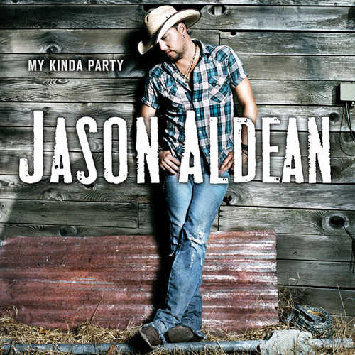
Need more proof that cowboys are the new vampires for hormonal teens? Check out what is #16 in the Billboard 100 this week:

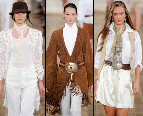
Luckily, I have lots of friends who are much more fashion forward than me who informed by that the catwalks of this year’s New York Fashion week also was brimming with wild western style, including Ralph Lauren’s collection. Derek Lam and Betsy Johnson have also been doing their own homage to the cowboys. Not everyone is a fan though: writing for the LA Times about Lauren’s new collection, Booth Moore said:

“The heavy-handed Western accents — oversized steer-head belt buckles, lacey blouses with leg o’ mutton sleeves, and a rodeo’s worth of leather and fringe — took this collection dangerously close to looking like something out of the wardrobe department of a big-budget Western.”

You be the judge, but I suspect we’ll see a lot more of these types of designs, in both fashion and graphics, in the comings months. I’ll keep you posted!